Young Designer to Aspiring Designers by Kelcey Gray

Originally published on the TOKY Blog on March 2, 2016

Now that the 2016 ADDYs are behind us and agencies around STL have nursed their hangovers, we at TOKY are taking a moment to reflect back on the events of Addy week and to be grateful for the city-wide participation that made the event so successful (as well as the personal achievements in the form of ADDY awards).

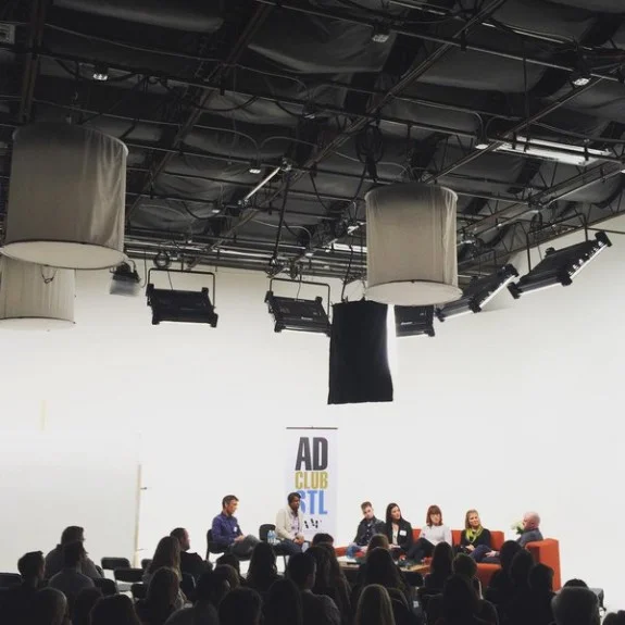
The Lambs, the Ladies, & the Leaders

But the week was about more than just the ADDY Awards themselves, though they were the pinnacle of local advertising design. Throughout the week leading up to the awards show, events were held around the St. Louis area that highlighted the best and brightest talent, networking opportunities, and educational opportunities for budding creatives. One of the first events was a series of panels — “The ADDYs Primer: Lambs, Ladies, and Leaders” — to get inside the minds of up and coming designers (the Lambs), inspiring women in the male-dominated industry (the Ladies), and some of STL’s most seasoned and awarded professionals (the Leaders). I sat in as a participant on the first of three panel sessions called “The Lambs” to discuss agency life from the perspective of notable young designers worth watching.

kelceytowell.thelambs.stladdys2016

The podcast for the entire panel can be heard below. In it, you can hear me give some advice for students looking to begin their creative career, along with some great observations from other guest panelists.


Your path to success as a creative is as unique and as driven as you are. Be flexible and open.


Choosing Your Path

I wanted to expand on this concept of “Lambs” and talk to the driven, creatively precocious students. Those bright-eyed designers with sparks in their eyes and fire their bellies to make something truly great work. I want to talk to the next generation of agency leaders.

Your path to success as a creative is as unique and as driven as you are. Be flexible and open.

Most creatives have a formal background in art and design, but which path is best — art school, grad school, something else? When asked about graduate school and whether or not I would recommend it to young designers and students, I’m up front about my path and decision-making process. For me, it was a specialized art degree following the traditional B.A. My program was a really good fit for me, but it depends on where you’re headed with your career. Your path may not be the same. Everybody’s route is different just as no two designers have the exact same set of talents. Find the path that nurtures your individual skills. It’s like finding a job in a way because not only does the school or program have to pick you, but you have to pick it in return.

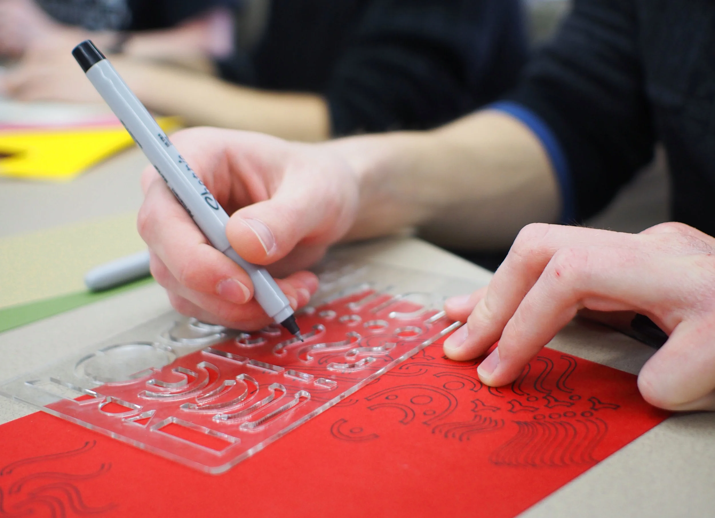
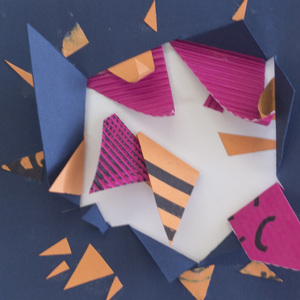
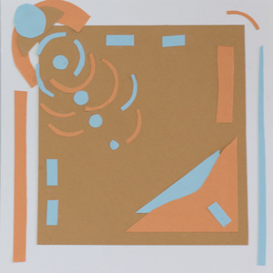
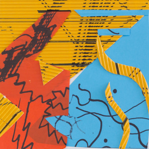
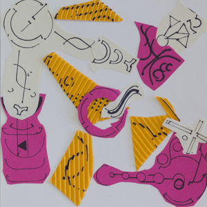
In grad school, and in your professional life, it is crucial to know yourself and your design process. One of the most valuable career learning experiences can be figuring out that process and how to apply it to a variety of different projects, both personally and for your employer. For example, while at TOKY, I particularly enjoy the challenge of finding ways to adapt my design process to satisfy client demands, while still staying true to a personal commitment to create beautiful and useful things. Your hands need to be as busy as your mind.

For me, working with traditional materials like paper or stepping away from Illustrator to sketch by hand helps add perspective to my on-screen work. Sometimes designers can find new school inspiration and answers in old school methodologies. It can be difficult to separate the creative career from technology, but young designers should develop an appreciation for analog processes; they are the building blocks of creativity. Get a little bit messy first. Discovering how you work will inform your work and help you learn how to work with others.

Finally, the best design is honest. So should you be with yourselves, young designers. Assess yourself and your work honestly, your talents and trajectory. Ask yourself what you want to achieve and consider where you want to land. Is it an agency? In-house creative? Or maybe you want to set up your own shop. Take a look at the schools out there, research their programs, and evaluate if those programs are in-line with your personal and career goals. If and when you choose to apply — be brave! You are designing your future.

Album Abstract by Kelcey Gray

WORKSHOP AIGA Student Conference 2016

AIGA Student Conference 2016

Recently, AIGA St. Louis invited Jim Walker and I to participate in their annual Student Conference. As former co-chair of the AIGA STL Student Conference, I know firsthand how valuable these experiences are for young, idealistic designers, so I’ve made a habit of giving back wherever possible —whether participating as a guest critic for seniors at local universities or meeting with students about their careers and future pursuits. This year’s Student Conference was held at Maryville University, just a short drive from downtown St. Louis.

Album Abstract was a conditional design exercise focused on making album art. Students were restricted in the materials, methods, and time they had to produce a complete album presentation. The jumping off point? To respond to a song through color, texture, and form. We provided a wide array of colored papers, markers, and scissors, introducing each one at different stages.

Students began the exercise exploring with color, listening to the entire song, and reacting creatively through color in response. With their color palettes decided, we guided the students to experiment with making tangible patterns. Using the Letter Maker, they focused on rhythm, pattern, and texture to develop their creative expression. Finally, students pulled everything together by containing those colors and textures into form, organizing their piece into a fixed space.

Results were varied, but each student was able to respond to these conditions in under 45 minutes and produce a considered piece of album art. Our hope is that they impose these types of conditions in future work and learn the value of such processes in making.

Selected Songs:
"The Sticks" by Budos Band
"The Yaba" by Battles
"Blue in Green" by Miles Davis

Work by Nikolai Laba, Dustin HigginBothom, Matthew Winchell, Kranti Thorat, Colin Boland, Ashley Polito, Michaela Murphy, Valarie Mclennan, Daniel Adams, Cory Sanders, Leah Strickman, Kristen Pauli, Kevin Ranyan, Chelsei Briggs, Patrick Peanick, Alex Braun, McKinzie Chelberg, Lindsay Fox Schoeder, Orianna Meontenegro, Taylor Deed, McKenzie Dorris, Jean Avendano, Aiden Zucker, Andria Graeler, Monica Lazalier, Savannah Meyers, Hayden Loos, Kelsey Conrad, John Taszarek, Thomas Hajny, Alex King, Kristen McMillion, Brittany Hewerdine, Garrett Streeter, Quentin Scheutz, Elizabeth Hess, Pearl Franz, Quinton Ward, Reshmie Punwasi, Augusta Golden, Mio Yoshigiwa, Eva Ju, Laura Heldotten, T.J. Patton, Amanda Kessinger, Alicia Arnold, Chrstina Woods, Emily Jurgensmeyer, Kelsey Neier, Jessica Hahs, Mandy Weber, Natalie Johnson, Alyssa Ilgonfritz, Kate Friedlein, Eric Horner, Michael Bertani, Julie Leise

Design As a Verb by Kelcey Gray

If we want to understand an object, we look to the “design” of it. The how, the why, and the path that gets us to the end result. In the English Language, we have one word to describe the intention behind an action or craft. This one word is meant to convey the entirety and depth of the process, plan, and thing itself: Design.

The Limitations of Language and the Innovation of the Dutch

A simple word, design, but it is deceptively innocuous. That one word encompasses a myriad of styles, principles, and purposes within the “design” umbrella — industrial, environmental, graphic — the list goes on. Regardless of field, the root of all is the Design itself; the overarching principle and ideal, concepting and purpose. It’s a noun and a verb — idea and action. It’s a lot of weight to communicate in six letters.

So how can we rethink the meaning of the word “design”? I’d suggest looking to the country that has produced some of the most prolific, innovative, and user-focused product design of the past century. The Netherlands’ design aesthetic is characterized variously as controlled, conceptual, minimalist, and playful (and occasionally humorous).

Dutch design embraces the experimental. This liberation of thought is a distinctly European approach that differs from most American design. Where English is limited to one descriptor for the world of idea AND action, The Dutch have two words for design itself: vormgevingand onterwerpen.

These words are more than a foreign sound to American ears. They’re largely foreign concepts when you’re used to a linear design process. Putting the emphasis on user interaction and intention, Dutch designers have given a more functional way to approach the design aesthetic and the way we talk about design.

Vormgeving Design

Vormgeving, to paraphase Gert Dumbar (chair of one of the Netherlands’ leading agencies), simply means making things look attractive and appealing. It is decorative and fashionable, without providing much in terms of practical usability. In practice, I react to this concept as making things that are trendy — objects and styles that are subject to fads and are forever at the mercy of popular opinion.

A feast for the eyes and the palette: Mast Brothers chocolate bar packaging. The bright and lovely patterns are sure to influence consumer decisions when deciding which sweet treat to splurge on. They’re delightful to look at, but in the end, the pa…

A feast for the eyes and the palette: Mast Brothers chocolate bar packaging. The bright and lovely patterns are sure to influence consumer decisions when deciding which sweet treat to splurge on. They’re delightful to look at, but in the end, the patterns are just a simple surface treatment, not a reinvention of the way we consume chocolate.

A beautifully crafted “table” from Critical Objects where function clearly follows form. This captivating and simple piece of furniture can essentially be considered a glorified cup holder. It may not be traditionally “successful” as a table, but it…

A beautifully crafted “table” from Critical Objects where function clearly follows form. This captivating and simple piece of furniture can essentially be considered a glorified cup holder. It may not be traditionally “successful” as a table, but it’s certainly a pleasure to look at.

Dumbar believes objects motivated by vormgeving are “bad for society.” Eventually, like a decadent dessert or an indulgent purchase, vormgeving is without lasting nutritional value and becomes obsolete quickly.

At the same time, I believe it is human nature to crave ephemeral pleasures and appreciate beauty for its own sake. We have a psychological need to have and design things that make us feel good without instilling them with a higher purpose. Vormgeving has a place in design, but should not be the foundation of it.

We have a psychological need to have and design things that make us feel good without instilling them with a higher purpose. Vormgeving has a place in design, but should not be the foundation of it.

Ontwerpen Design

At the other end of the spectrum, ontwerpen is the focus on innovation for practical material applications. Dumbar advocates for ontwerpen as the more valuable pursuit because it is functionally closer to engineering: “invent[ing] a new thing — which is intellectual, which is clever, and which will have long life.”

The US Patent for velcro and the stacking chair: where form follows function. No one can argue that the invention of velcro changed the way we design fasteners. Cheap to produce, simple to use, and easily accessible, velcro has made a lasting impact…

The US Patent for velcro and the stacking chair: where form follows function. No one can argue that the invention of velcro changed the way we design fasteners. Cheap to produce, simple to use, and easily accessible, velcro has made a lasting impact on everything from industrial design to military uniform outfitting.

How do you fit 500 people in a conference room that has 15-square feet of storage? Solution: stacking chairs. No doubt, the lone non-stackable chair has an inherent function. But when stacked, they gain an additional function: convenience, without s…

How do you fit 500 people in a conference room that has 15-square feet of storage? Solution: stacking chairs. No doubt, the lone non-stackable chair has an inherent function. But when stacked, they gain an additional function: convenience, without sacrificing real estate.

Dumbar argues in favor of ontwerpen. Design that honors function and durability has more merit than simply a treated surface.

A perfectly designed object or concept brings elegance (in the mathematical sense of the word) to usability. Balanced functionality and usability that is intentional in every step of the design process satisfies us more deeply and nurtures the creative spirit. These are the things that we return to over and over again because of their practicality and pleasure —ontwerpen becomes heirloom design.

Designer’s Baggage

As an exercise, an industrial design professor asked me to redesign a simple plastic water bottle. I set to work sketching new forms, researching portable water bottles, shipping methods and point of sale displays, and distilling a brand into a bottle with a screw-top lid.

Feeling satisfied with my results, I presented the research and refined sketches. “Okay, yes,” she said, “But have you given any thought to inventing a better vessel? One not made of cylindrical plastic. But that will function as a portable container for liquid?” This is the spirit of onterwerpen. Stepping back from what we know, letting go of the baggage that comes with assumptions and familiarity, and actually getting to the meat of reinvention and improvement.

The distinction between vormgeving and ontwerpen and our own nebulous and multifunctional “design” goes beyond language and approaches philosophy. In English, we can tack an adjective in front of the word “design” and it becomes descriptive of the value and ideation, gives us an idea of its purpose. But these words do not speak of intent or the values built into the process of design itself.

To me, the most beautiful and valuable meaning, inherent in both vormgeving andontwerpen, is the idea of intention.

To me, the most beautiful and valuable meaning, inherent in both vormgeving andontwerpen, is the idea of intention. “Intent” is implicit in our own singular English translation, but only if you’re fluent in a dead language. The Latin root “designo” or “designare”, indicates planning, schemes, and taking intentional, directed action.  “Design” and “designate” both share the same root, which is a nice touchstone to hold on to during the design process.

As designers, we are handed projects that can be considered solely vormgeving, exclusively ontwerpen, or some balance of the two depending on their audience and purpose. Being open to new ideas, even those from unexpected places or mistakes, is part of the process of releasing our design baggage and attaining design freedom.

Originally featured on Toky.com/blog/ on March 23, 2015